Now that A LOT of our ‘physical’ storefronts are closed, we are really relying on our VIRTUAL STOREFRONTS to help keep us afloat.
In our last post, we <briefly> discussed Device Responsive Websites……so let’s get into the nitty-gritty!
In the field of Web design and development, we’re quickly getting to the point of being unable to keep up with the endless new resolutions and devices. For many websites, creating a website version for each resolution and new device would be impossible, or at least impractical. Should we just suffer the consequences of losing visitors from one device, for the benefit of gaining visitors from another?
Why should I switch my website to RWD?
Your website looks great of the desktop screen but it may not be true when your site is viewed on a smartphone or a tablet. Once you make the design responsive, the website will look good (and readable) on all screens.
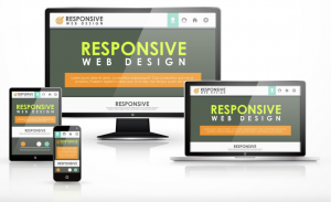
With Responsive Design you can create one design and it will automatically adapt itself based on the screen size of the mobile device. This approach offers plenty of advantages:
- It saves time and money as you don’t have to maintain separate websites for desktops and mobile phones.
- Responsive Design is good for your website’s SEO (search rankings) as every page on your site will have a single URL and thus Google juice is preserved. You don’t have to worry about situations where some sites link to your mobile site while others link to your desktop site.
- Your Google Analytics reports will paint a better picture of your site’s usage since the data from mobile and desktop users will be consolidated.
- The same will be true for the social sharing stats (Facebook Likes, Tweets, +1’s) since the mobile and desktop versions of your web pages will have the same URL.
- Responsive Designs are easier to maintain as they do not involve any server-side components. You just have to modify the underlying CSS of a page to change its appearance (or layout) on a particular device.
How do I check if particular website is using Responsive Design?
That’s easy. Open that website in any desktop browser and resize the browser. If the site’s layout changes as you resize, the design is responsive.
What Is Responsive Web Design?
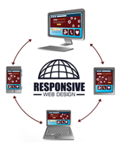
Responsive Web design is the approach that suggests that design and development should respond to the user’s behavior and environment based on screen size, platform and orientation.
The practice consists of a mix of flexible grids and layouts, images and an intelligent use of media queries. As the user switches from their laptop to iPad, the website should automatically switch to accommodate for resolution, image size and scripting abilities. One may also have to consider the settings on their devices; if they have a VPN for iOS on their iPad, for example, the website should not block the user’s access to the page. In other words, the website should have the technology to automatically respond to the user’s preferences. This would eliminate the need for a different design and development phase for each new gadget on the market.
But responsive Web design is not only about adjustable screen resolutions and automatically resizable images, but rather about a whole new way of thinking about design. Let’s talk about all of these features, plus additional ideas in the making.
Adjusting Screen Resolution
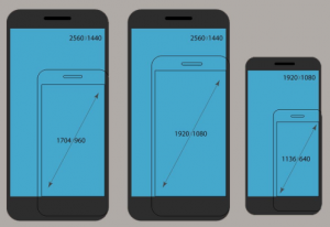
 With more devices come varying screen resolutions, definitions and orientations. New devices with new screen sizes are being developed every day, and each of these devices may be able to handle variations in size, functionality and even color. Some are in landscape, others in portrait, still others even completely square. As we know from the rising popularity of the iPhone, iPad and advanced smartphones, many new devices are able to switch from portrait to landscape at the user’s whim. How is one to design for these situations? In addition to designing for both landscape and portrait (and enabling those orientations to possibly switch in an instant upon page load), we must consider the hundreds of different screen sizes. Yes, it is possible to group them into major categories, design for each of them, and make each design as flexible as necessary. But that can be overwhelming, and who knows what the usage figures will be in five years? Besides, many users do not maximize their browsers, which itself leaves far too much room for variety among screen sizes.
PART OF THE SOLUTION: FLEXIBLE EVERYTHING
A few years ago, when flexible layouts were almost a “luxury” for websites, the only things that were flexible in a design were the layout columns (structural elements) and the text. Images could easily break layouts, and even flexible structural elements broke a layout’s form when pushed enough. Flexible designs weren’t really that flexible; they could give or take a few hundred pixels, but they often couldn’t adjust from a large computer screen to a netbook. Now we can make things more flexible. Images can be automatically adjusted, and we have workarounds so that layouts never break (although they may become squished and illegible in the process). While it’s not a complete fix, the solution gives us far more options. It’s perfect for devices that switch from portrait orientation to landscape in an instant or for when users switch from a large computer screen to an iPad.
Flexible Images
One major problem that needs to be solved with responsive Web design is working with images. There are a number of techniques to resize images proportionately, and many are easily done. As long as no other width-based image styles override this rule, every image will load in its original size, unless the viewing area becomes narrower than the image’s original width. The maximum width of the image is set to 100% of the screen or browser width, so when that 100% becomes narrower, so does the image. It’s a great and simple technique to resize images beautifully.
While the above is a great quick fix and good start to responsive images, image resolution and download times should be the primary considerations. While resizing an image for mobile devices can be very  simple, if the original image size is meant for large devices, it could significantly slow download times and take up space unnecessarily.
The End? NOPE!
We are indeed entering a new age of Web design and development. Far too many options are available now, and there will be far too many in the future to continue adjusting and creating custom solutions for each screen size, device and advancement in technology. We should rather start a new era today: creating websites that are future-ready right now. Understanding how to make a design responsive to the user doesn’t require too much learning, and it can definitely be a lot less stressful and more productive than learning how to design and code properly for every single device available.
Responsive Web design and the techniques discussed above are not the final answer to the ever-changing mobile world. Responsive Web design is a mere concept that when implemented correctly can improve the user experience, but not completely solve it for every user, device and platform. We will need to constantly work with new devices, resolutions and technologies to continually improve the user experience as technology evolves in the coming years.
Besides saving us from frustration, responsive Web design is also best for the user. Every custom solution makes for a better user experience. With responsive Web design, we can create custom solutions for a wider range of users, on a wider range of devices. A website can be tailored as well for someone on an old laptop or device as it can for the vast majority of people on the trendiest gadgets around, and likewise as much for the few users who own the most advanced gadgets now and in the years to come. Responsive Web design creates a great custom experience for everyone. As Web designers, we all strive for that every day on every project anyway, right?

 317-289-4965